Web Design
Want to make your website stand out? Design that captivates, functions, and connects.
Furtina.com - Furniture Online Shop
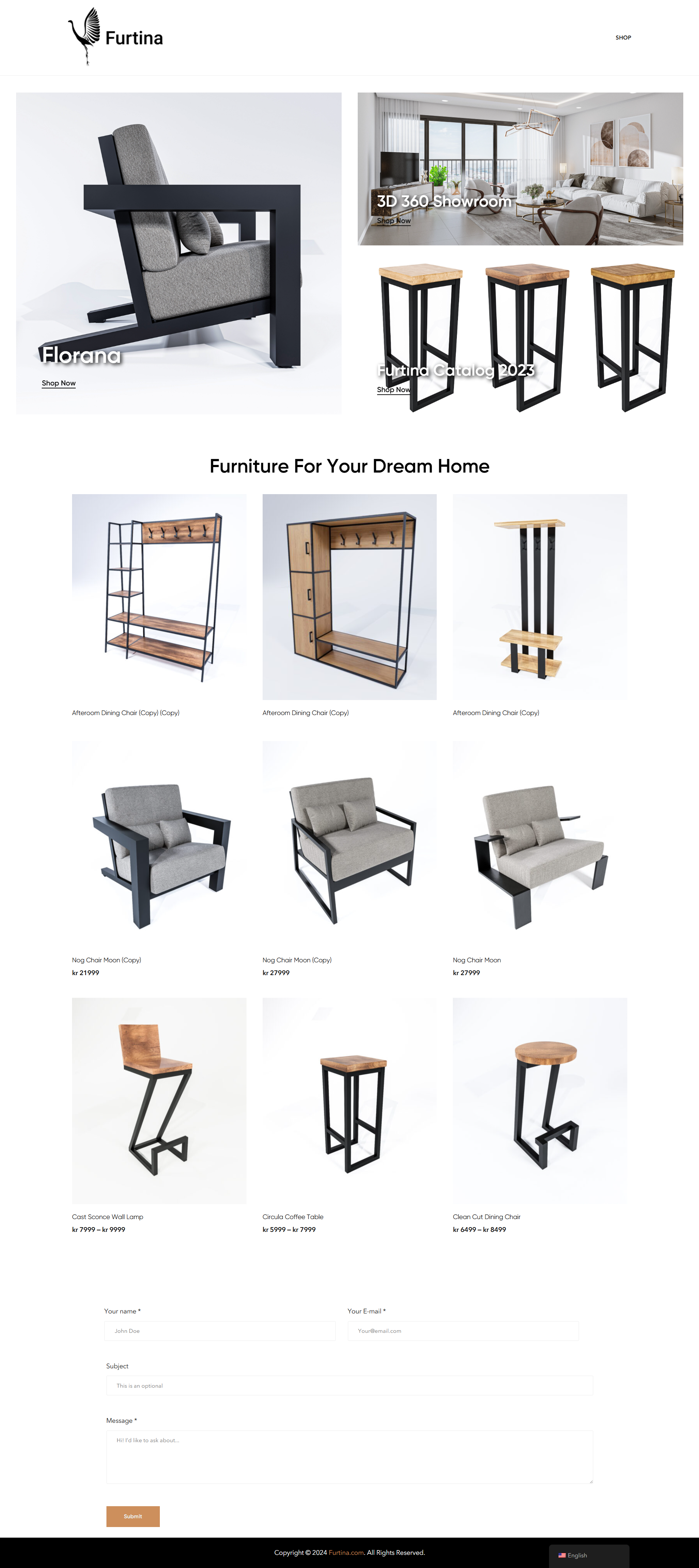
I designed this website with a strong focus on delivering both aesthetic appeal and functionality. By leveraging SolidWorks and Cinema 4D, I created high-quality 3D renderings for the product visuals, allowing visitors to experience a realistic, detailed view of each furniture item. This attention to detail helps elevate the brand’s professionalism and provides a clear understanding of the product’s features, materials, and design.
The website is structured with a minimalist approach, ensuring that users can easily navigate between categories, browse product selections, and quickly access relevant information such as pricing and descriptions. I emphasized simplicity in the layout, using white space effectively to create a clean, uncluttered shopping experience.
The 3D 360° Showroom and Furtina Catalog 2023 sections further enhance user engagement by offering an interactive experience that brings the products to life. Visitors can explore the pieces in greater depth, giving them a comprehensive view of the furniture, which ultimately boosts confidence in purchasing.
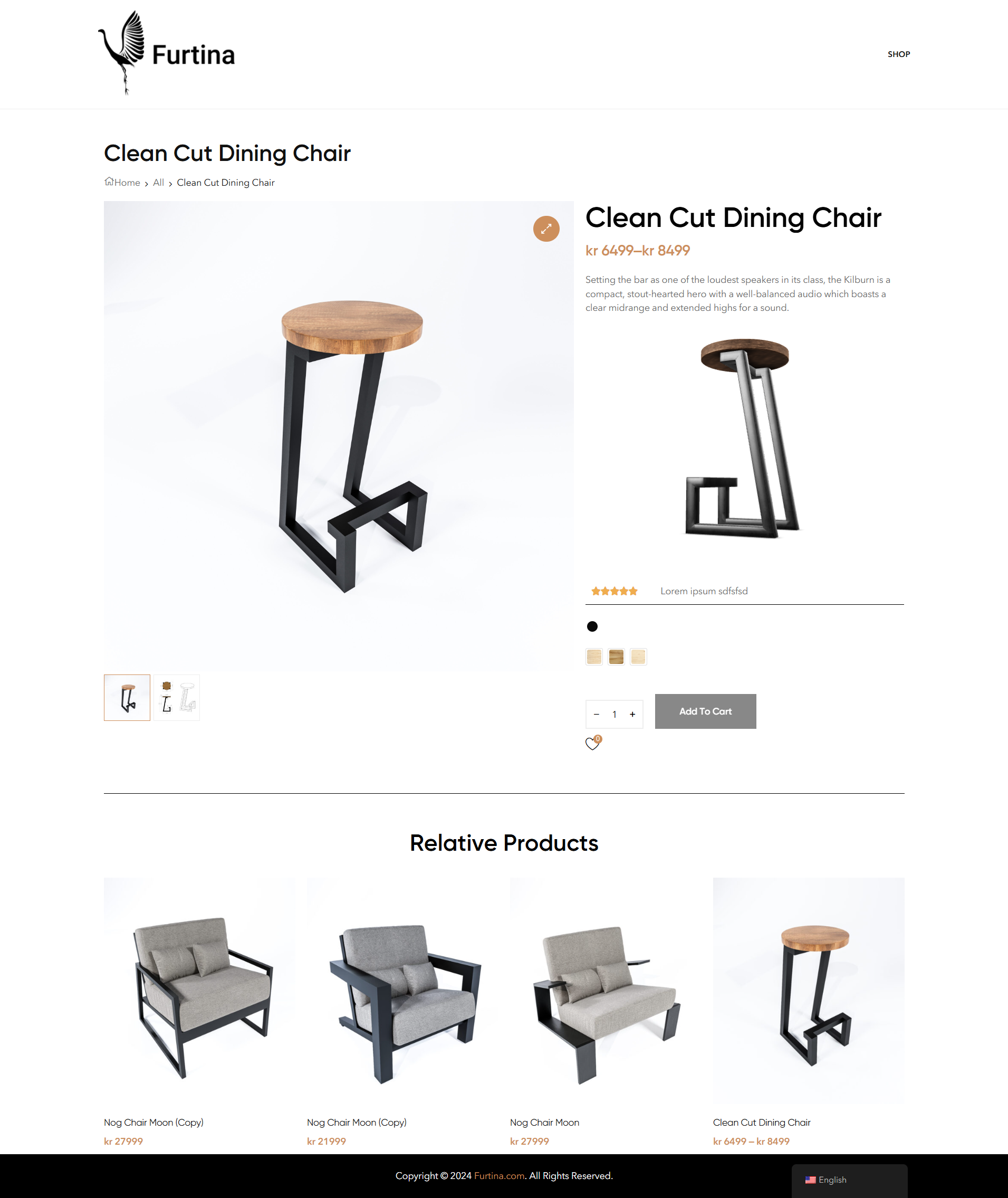
The product pages, such as the “Clean Cut Dining Chair” page, showcase the furniture with multiple high-resolution images and customizable options (like material choices), allowing customers to tailor their selections. The inclusion of related products at the bottom of the product pages ensures that users stay engaged and explore other items, increasing potential sales opportunities.
Incorporating these visual and interactive elements with SolidWorks and Cinema 4D allows the website to stand out in the competitive furniture market. The overall user experience is enhanced through intuitive design, clean visuals, and engaging content, making it easy for customers to navigate, explore, and make informed purchasing decisions.
Arkkitchen.no - Built-In Kitchen Furniture
For the website of Arkkitchen.no, I focused on creating a seamless and modern online experience for visitors interested in built-in furniture. The design is minimalist, with an emphasis on clean lines and intuitive navigation. The layout ensures that potential customers can easily explore Arkkitchen’s range of products and services without feeling overwhelmed by excessive information.
I incorporated a soft, neutral color palette, which not only enhances the visual appeal but also reflects the elegance and functionality of the built-in furniture designs. The use of high-quality imagery showcasing the furniture in real-life settings allows customers to visualize how the pieces will enhance their own spaces, creating a strong emotional connection with the brand.
Clear call-to-actions such as “Explore Our Collection” are strategically placed throughout the site, guiding users to discover more about the custom-built solutions Arkkitchen offers. The product pages are well-organized, presenting essential details in a visually appealing and easy-to-understand format, helping visitors make informed decisions quickly.
Additionally, the website has been designed to ensure smooth, frictionless interactions. The contact form is positioned for easy access, making it simple for potential customers to reach out with inquiries or project requests. By prioritizing both form and function, the site reflects Arkkitchen’s commitment to quality, making it a trusted source for built-in furniture solutions.

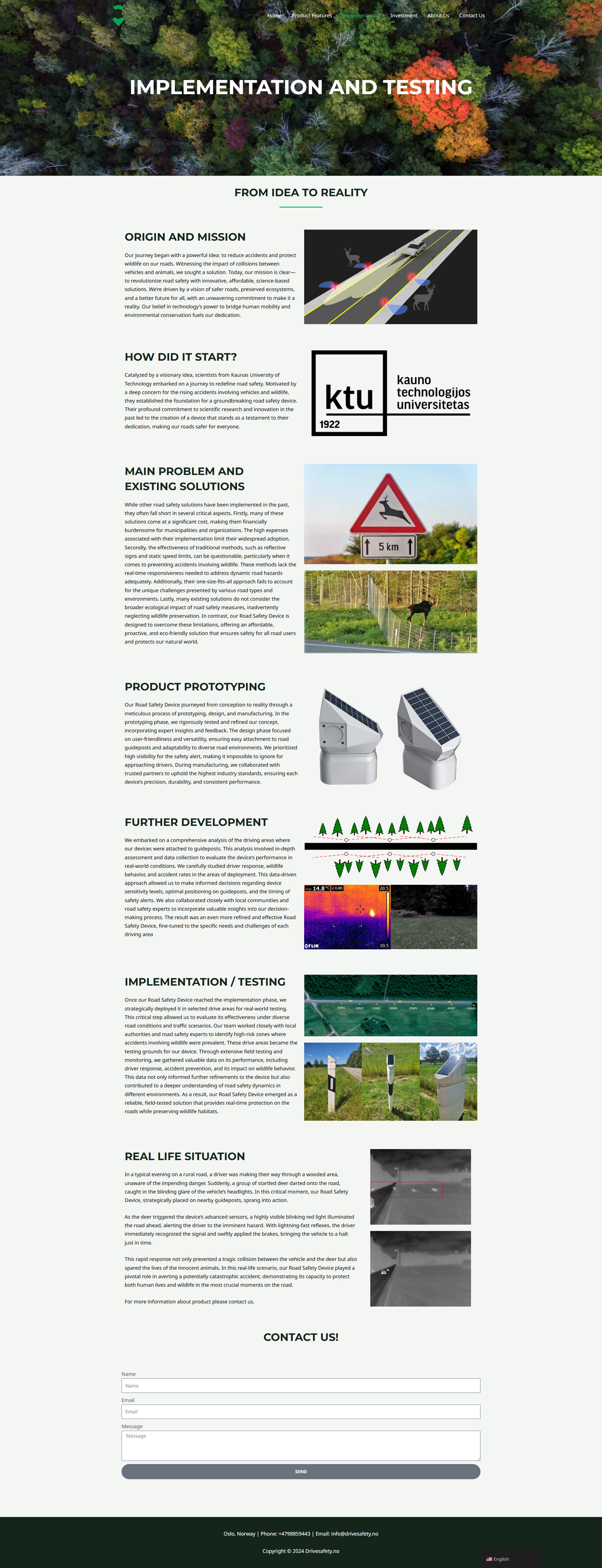
Drivesafety.no - Device to Protect the Nature!
I designed this website with a strong focus on both visual appeal and user experience. The overall layout is clean and professional, using a minimalist approach that helps visitors easily navigate and find information without being overwhelmed. The use of a green color palette aligns with the company’s branding and emphasizes its global reach, highlighted by the map that serves as a central visual element. This visual immediately communicates the company’s international focus, making the site feel relevant and trustworthy for businesses looking to expand.
I incorporated clear, prominent call-to-actions like “See More” to guide users naturally through the site and encourage further engagement with the content. Each section is thoughtfully organized, with icons used in the “Our Services” area to break down complex offerings in a visually simple way. This makes it easier for visitors to quickly understand the company’s services at a glance, without needing to read through long paragraphs of text.
Additionally, I made sure the website is user-centric by ensuring that every interaction feels smooth and intuitive. The contact form is placed strategically at the bottom of the page, providing an easy point of communication for visitors. The inclusion of a meaningful quote about product success helps to build credibility and creates an emotional connection with potential clients.

L'Export Solutions - Sales Engineering Website
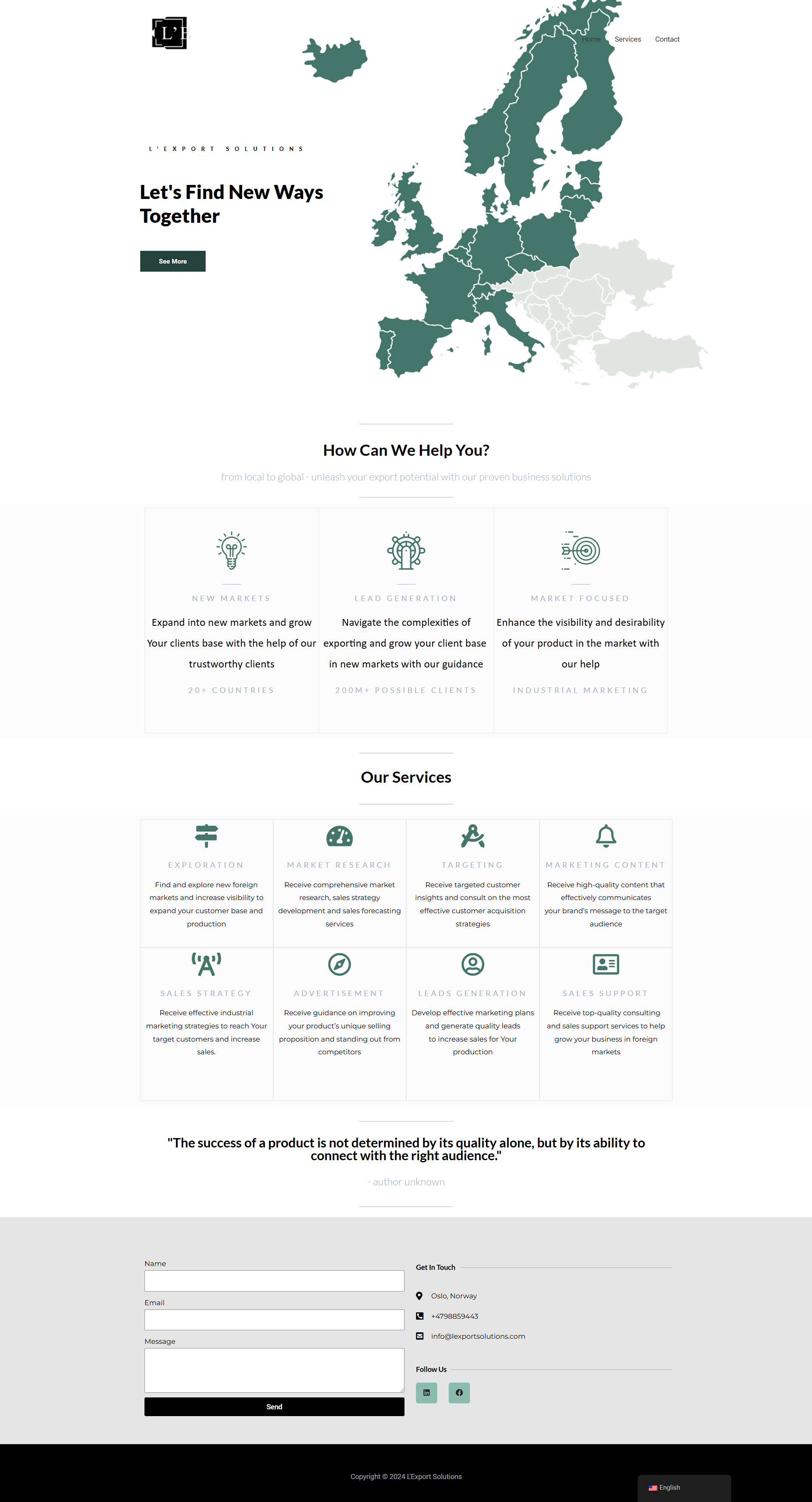
I designed this website with a strong focus on both visual appeal and user experience. The overall layout is clean and professional, using a minimalist approach that helps visitors easily navigate and find information without being overwhelmed. The use of a green color palette aligns with the company’s branding and emphasizes its global reach, highlighted by the map that serves as a central visual element. This visual immediately communicates the company’s international focus, making the site feel relevant and trustworthy for businesses looking to expand.
I incorporated clear, prominent call-to-actions like “See More” to guide users naturally through the site and encourage further engagement with the content. Each section is thoughtfully organized, with icons used in the “Our Services” area to break down complex offerings in a visually simple way. This makes it easier for visitors to quickly understand the company’s services at a glance, without needing to read through long paragraphs of text.
Additionally, I made sure the website is user-centric by ensuring that every interaction feels smooth and intuitive. The contact form is placed strategically at the bottom of the page, providing an easy point of communication for visitors. The inclusion of a meaningful quote about product success helps to build credibility and creates an emotional connection with potential clients.
Shop3D - Marketing, Animations, Web Solutions
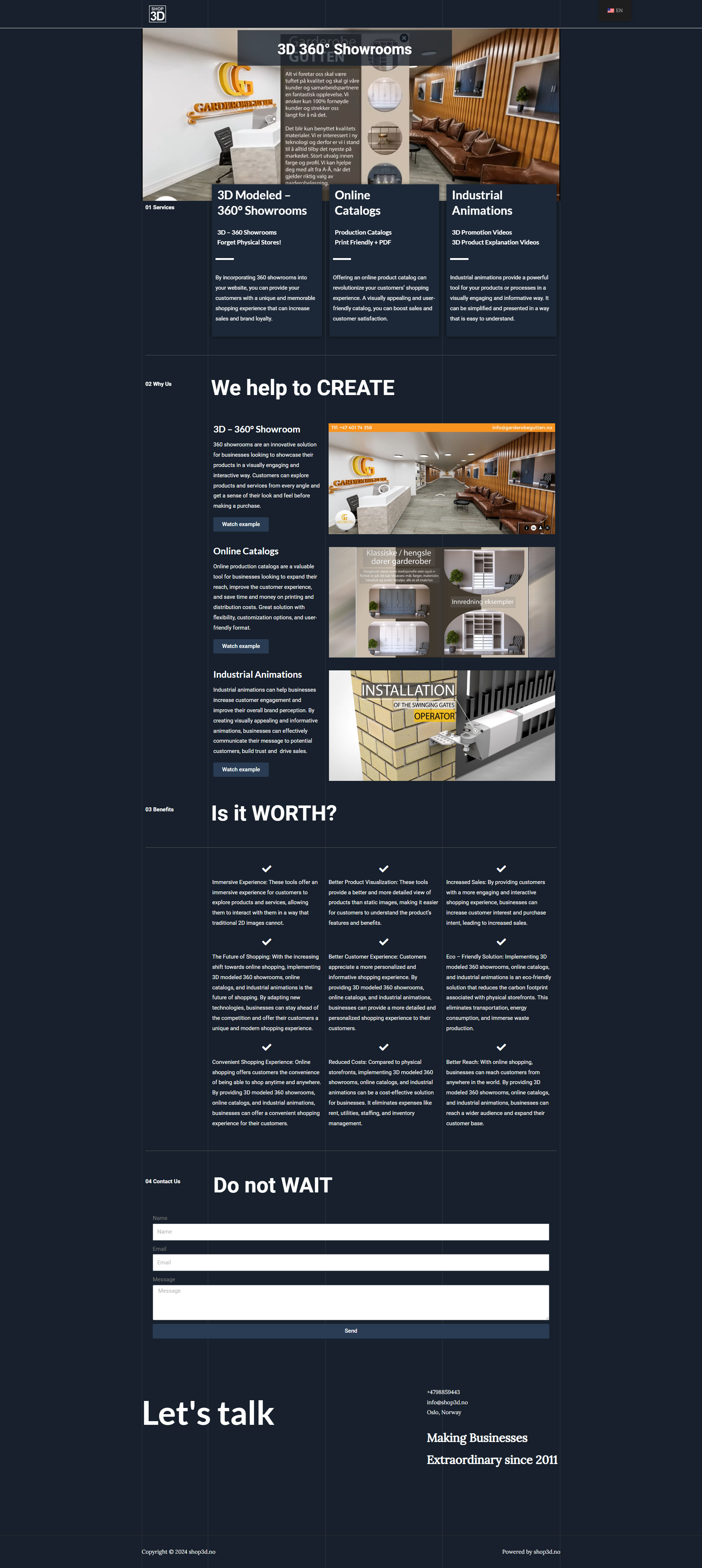
I designed this website with a strong emphasis on creating an immersive, visually appealing experience, using 3D showrooms and animations to engage users right from the start. The layout is clean and professional, guiding visitors naturally through the content while keeping their focus on the interactive elements like the 3D showrooms and product demonstrations.
I incorporated bold, clear call-to-actions like “Watch example” to encourage users to interact with the site and explore the services in more depth. Each section is carefully organized, with benefits and services outlined clearly, making it easy for visitors to quickly grasp the value the company provides. The focus on 3D visualizations enhances the user experience, offering customers a chance to explore products and services in a unique, engaging way.
I ensured that the design is user-centric, with intuitive navigation and seamless transitions between sections. The contact form is prominently placed, encouraging visitors to reach out without hesitation. The overall design creates an engaging, professional platform that effectively showcases the company’s innovative solutions.
Additionally, the “Is it Worth?” section is strategically placed to outline the benefits of the services provided, offering users a clear breakdown of why investing in these innovative 3D solutions can drive business growth. This section serves as a powerful tool for building trust and reinforcing the value of the services, encouraging potential clients to take the next step.
3rdEye.no - Software Development and Engineering Website
I designed this website with a focus on showcasing product engineering and software development solutions in a clear, professional, and engaging manner. The home page highlights key offerings such as research, hardware, software, and R&D engineering with a minimalistic yet modern style that makes navigation simple and intuitive. This ensures visitors can quickly find the services they need without being overwhelmed by information.
The 3D visual elements, combined with technical project descriptions, help build trust and convey expertise. For example, detailed sections on projects like the Corrosion Detection System, Wood Defects Detection System, and the Road Safety Device for Wild Animals illustrate the company’s innovative capabilities. Each project includes visuals and a brief overview, making complex solutions easy to understand at a glance.
I used dark themes paired with bold, white text to create a sleek, high-tech aesthetic that appeals to professionals in the engineering and software sectors. Additionally, I integrated tools and programming languages like Python, TensorFlow, and Keras into the project descriptions, which not only showcases the technical expertise but also makes the website appealing to a more technically inclined audience.
The call-to-action buttons like “Check this project” and “Check the code” encourage users to engage with the projects and delve deeper into the company’s technical solutions. The entire website is built to communicate the value of innovative, cutting-edge engineering services in a clear and approachable way, making it effective for generating leads and building client trust.
